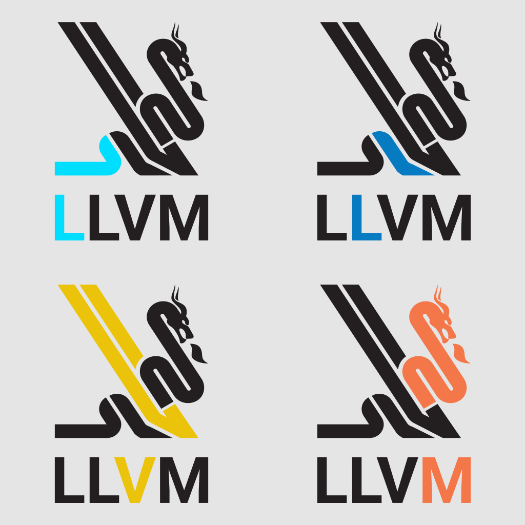
Thanks everyone for the feedback! The response has been better than I was hoping for in both scale and sentiment which means we can make some pretty reasonable conclusions.
First of all a few stats:
- This is now the most viewed thread on this forum (as far as I can tell) with almost 8k views
- 292 upvotes on r/programming (87% Upvoted)
- 29 upvotes on r/design (94% Upvoted)
- 62 comments from the two reddit threads combined which are overwhelmingly positive (especially if you take into account upvotes on the comments).
I get the impression that r/design was more positive than r/programming partially because there was less of an attachment to the current logo among non programmers and some r/programming users down voted because a logo is not programming and they didn’t think it should be on the subreddit. That’s just a guess though.
I recommend reading the two threads linked above. There are definitely some common criticisms that are worth going through that I summarise below but first just so I don’t give the wrong impression it’s worth noting that these are the two most upvoted comments:

Criticism Summary:
The LLVM acronym is hard to make out in the logo and bring little value to the logo
I would agree that the letters are hard to see, though I’m not convinced that is necessarily an issue as I quite like them even if they are just an easter egg that most people miss.
I can see the argument that removing the letters might result in a cleaner overall design though, which is probably more important. That said more people liked them than didn’t so I think there is a bit of a trade off to be made here.
There’s too much negative space on the right and it doesn’t look “balanced”
I think I agree with that critique as well. One user proposed the raised tail version which I quickly put together and added to the OP and most people seem to prefer that. I think they prefer it partly because it addresses this critique but also because like @DesmondWillowbrook points out it makes the logo appear more “active”.
This new logo doesn’t say anything about LLVM and doesn’t have the charm of the original
I think this gets at your point @SamuraiCrow. Comments that this version isn’t as fun, is too formal and doesn’t say anything about LLVM were not common but present and I think need addressing.
Partly I think some of these comments were tied into the more general issue of nostalgia (some explicitly mention this) and some were I think just outright joking:
Some users mentioned that they don’t like the trend of simplifying / flattening logos and some others just outright think that the original is cooler (can’t win them all) but the critique that this logo doesn’t represent LLVM is I think a failure case (less so that the logo don’t say anything) if it’s true.
Partly it was my intention to make the logo less fun and more formal and here’s why. The message the logo should have conveyed in the past (and I would argue did, even if I have problems with it) was that LLVM is “fast”, “cool”, “smart”, “fun” and “open to people who would like to get involved”. LLVM was a new technology coming from a research project that had a lot to prove and was trying to beat some pretty big and well established ways of doing things. That was almost 20 years ago though and today I would describe LLVM as a foundational pillar on which a lot depends. It’s no longer just a research project made up of programmers who enjoy playing dnd/yugio/pokymon. It’s a 501(c)(3) nonprofit Foundation with a board of directors, many heavy hitting sponsors and many responsibilities (grants, sponsorships, financial reports, etc).
At this point I think the message LLVM’s logo should be conveying is that the project has institutional staying power in which you can place your grant money and trust (A little like a bank). LLVM is not trying to directly appeal to hobbyists or programmers in the same way as in the past, it’s trying to gain and increasingly retain the favour of large sponsors and research institutions. I also think LLVM is at a point where it can impose it’s own meaning into a symbol and probably get away with something much more abstract than my design. It’s already proved that it is fast, smart and able to compete with other compiler stacks so a logo that says little would by association to LLVM end up meaning all of the above. That said it’s possible I’ve overshot the mark, misinterpreted the “feel” that LLVM should be going for or just not achieved the look I wanted.
I’m up for making a few more versions to get it right but not if this becomes a endless task to please everyone. I’m not exactly sure who would have the final word on something like this so I might reach out on the mailing list to find out, if they say that LLVM has no interest in a logo change then we can leave it here. I think the overall response has shown that there is interest though so I’m hoping that is not the case.


